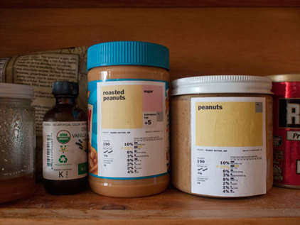
On July 31st, I discussed being suave and effective when talking to people about their food choices. A sexy, new food label may be one of the communication tools used to help convert people to eating more consciously. The University of Berkeley's Graduate School of Journalism had this very idea and launched a contest earlier this summer to redesign the food label called, simply enough...Rethink the Food Label. On July 25th, Renee Walker, was awarded the first prize for her label concept. Check out the picture above with a sample of Renee's design. As a visual learner, I love it! If a food is crammed with all kinds of preservatives or too much salt or sugar, this label is going tell you - each ingredient gets a proportionally, sized, colored box relative to the amount of other ingredients. A solid, colored square will more often than not indicate a whole food. Unless of course it's something like cotton candy and then it would just be a big, pink square for sugar...not wholesome. My only suggestion...how about a section on the food label where it tells you more about where the food was made and by who. The folks at AgroEco Coffee have designed a label for their packaging to connect drinkers to growers by telling them more about the farm, where it is, the beans, the owners, etc.... Okay Renee, there's your next hurdle...concisely and artistically design a label that educates us both on the nutrition and the origin.
We see at them every day but probably don't read them nearly enough. I'm talking about...nutrition labels. Those things on the back of canned goods and cereal boxes telling us the ingredients and the percentage of carbs and calories. Now, if food labels were a little bit more sexy and easier to understand, we may pay better attention. And in doing so, people would discover for themselves what's really in their food.
On July 31st, I discussed being suave and effective when talking to people about their food choices. A sexy, new food label may be one of the communication tools used to help convert people to eating more consciously. The University of Berkeley's Graduate School of Journalism had this very idea and launched a contest earlier this summer to redesign the food label called, simply enough...Rethink the Food Label. On July 25th, Renee Walker, was awarded the first prize for her label concept. Check out the picture above with a sample of Renee's design. As a visual learner, I love it! If a food is crammed with all kinds of preservatives or too much salt or sugar, this label is going tell you - each ingredient gets a proportionally, sized, colored box relative to the amount of other ingredients. A solid, colored square will more often than not indicate a whole food. Unless of course it's something like cotton candy and then it would just be a big, pink square for sugar...not wholesome. My only suggestion...how about a section on the food label where it tells you more about where the food was made and by who. The folks at AgroEco Coffee have designed a label for their packaging to connect drinkers to growers by telling them more about the farm, where it is, the beans, the owners, etc.... Okay Renee, there's your next hurdle...concisely and artistically design a label that educates us both on the nutrition and the origin.
0 Comments
Leave a Reply. |
Archives
June 2013
Categories
All
|